Touch Grass Yoga offers, through its founder Ambriehl Crutchfield, a community-oriented yoga experience with the goal of educating students in the use of yoga and meditation practices. The instructor offers private and group classes in parks in Nashville and Cincinatti.
In the initial phase, dedicated to research and strategy, we dive into the project and create guidelines that guide its communication and the creation of its visual identity. At that moment we realized the strength of simplicity, community and practice inside and outside the yoga mat.
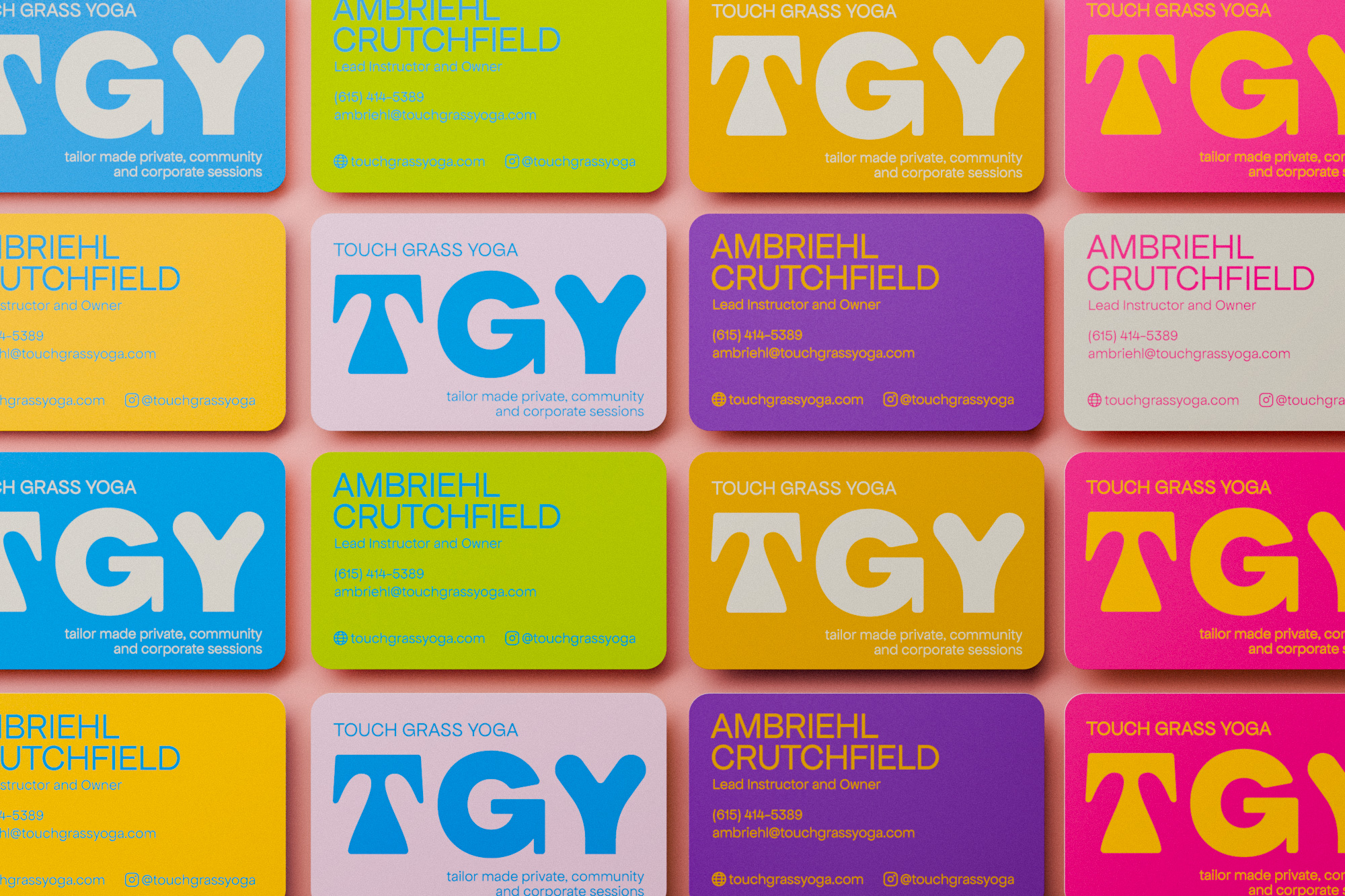
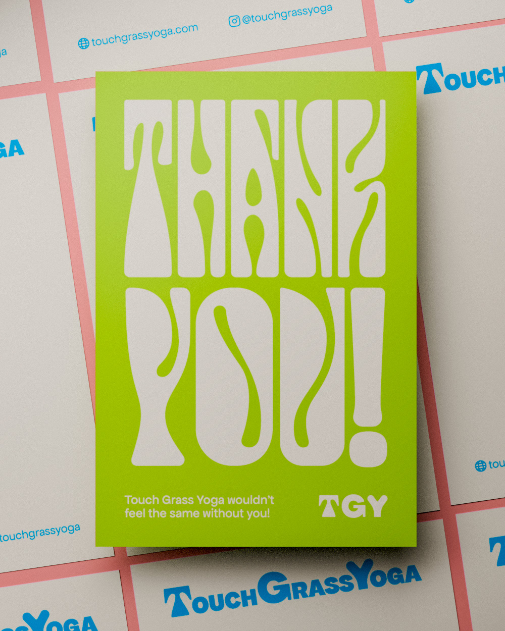
After validating the strategy with Ambriehl, we moved on to creating the visual identity. Largely inspired by the visual language of posters, album covers and other artifacts related to the American black musical universe, we designed each of the 3 letters that make up the brand's acronym. The result is a set that expresses stability, balance and firmness, with original curvilinear touches – visual characteristics that are present in the yoga universe.
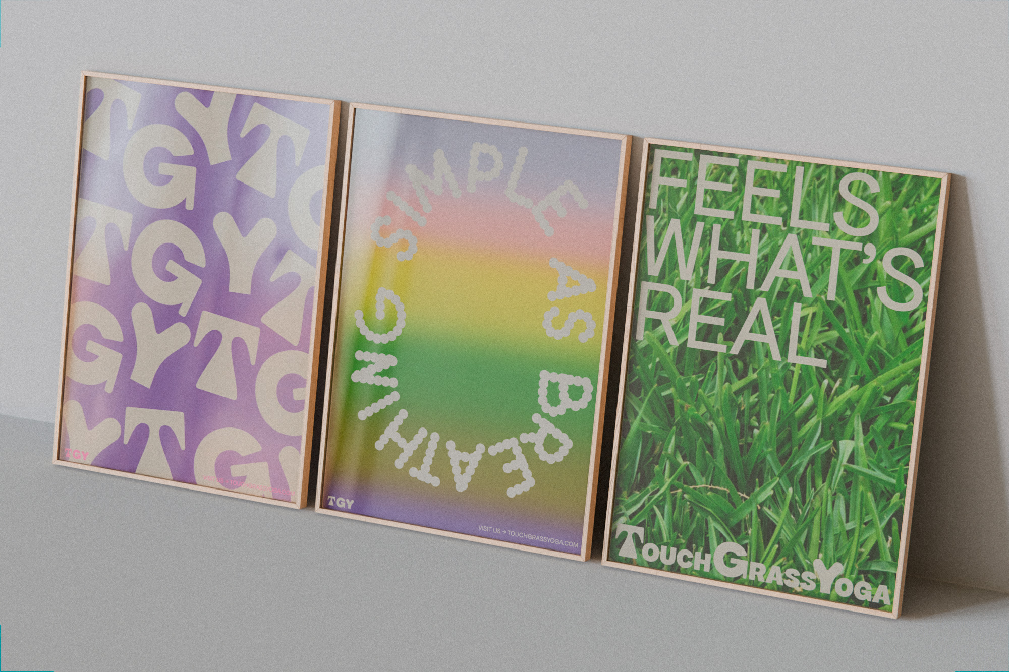
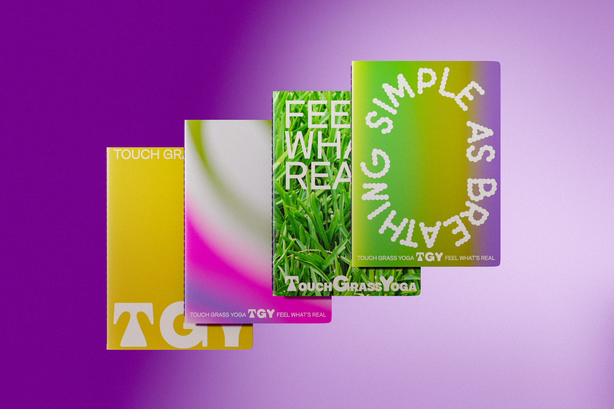
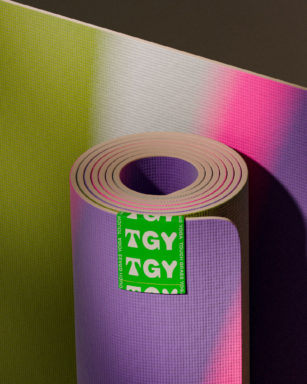
The chromatic combinations suggest dynamism and contemporaneity, and allow the brand's applications to vary from one another. The visual identity also has stripes that allow the text to be applied to different images, maintaining its visual consistency.

