Arado is a creative studio focused on researching and disseminating popular Brazilian imagery, especially rural ones. Through authoral and commissioned projects, since 2017, it has been publishing elements that help to understand the cultural formation of Brazil.
In 2020, they invited us to redesign their logo, as well as create a visual system that would help the brand taking into account the creation of content and copyright products.
In the initial phase of the project, dedicated to research and strategy, we created the essence of the brand, with guidelines that guide its communication and the creation of its visual identity. The phenomenological perspective, imaginative power, respect for heritage, hybrid practice and timeless performance were important pillars revealed through diving into the brand's manifestations.
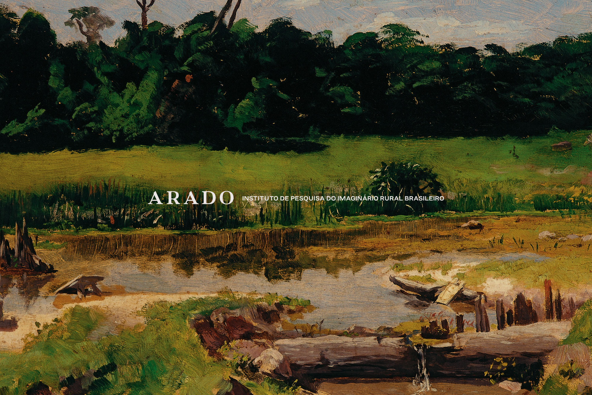
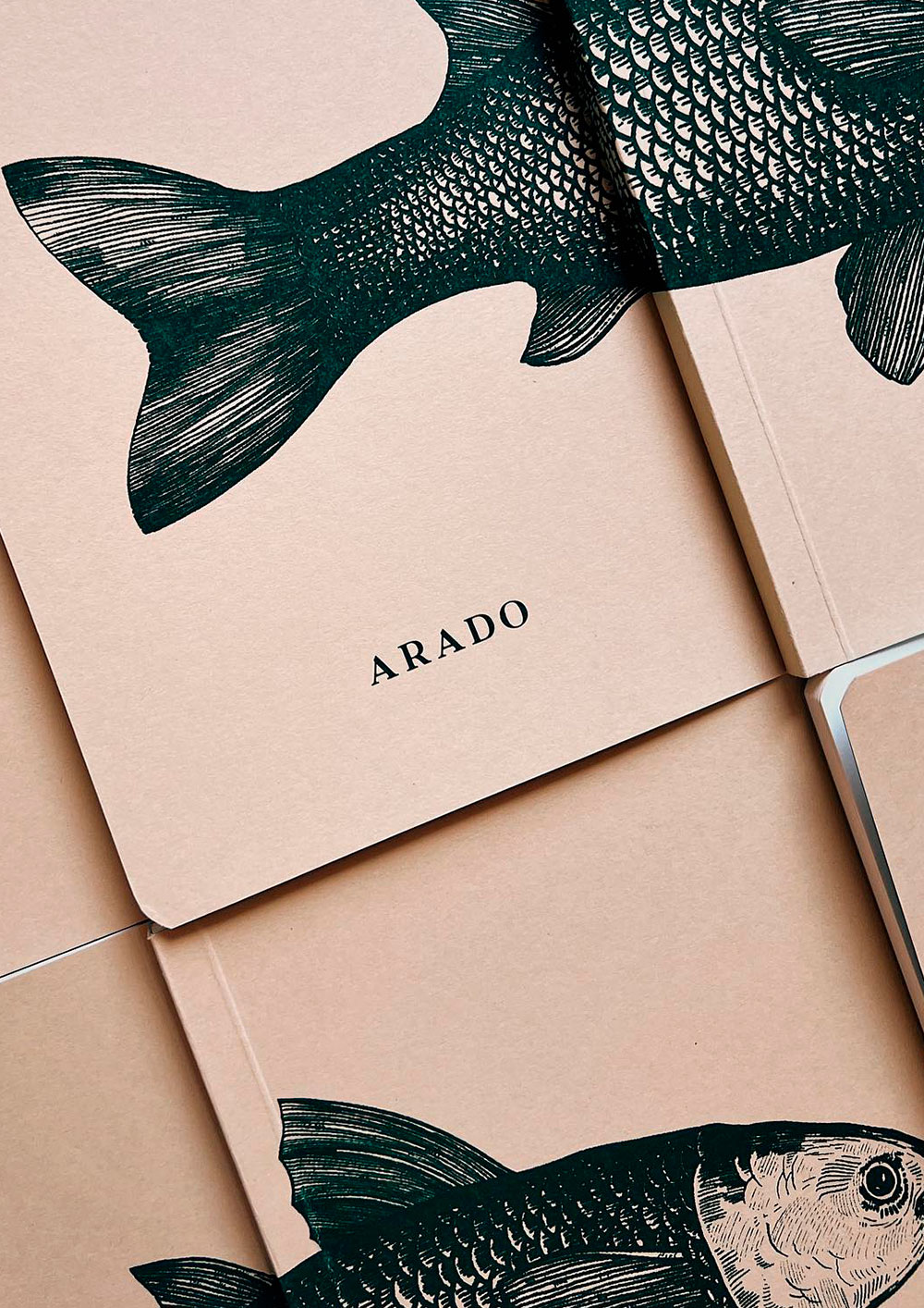
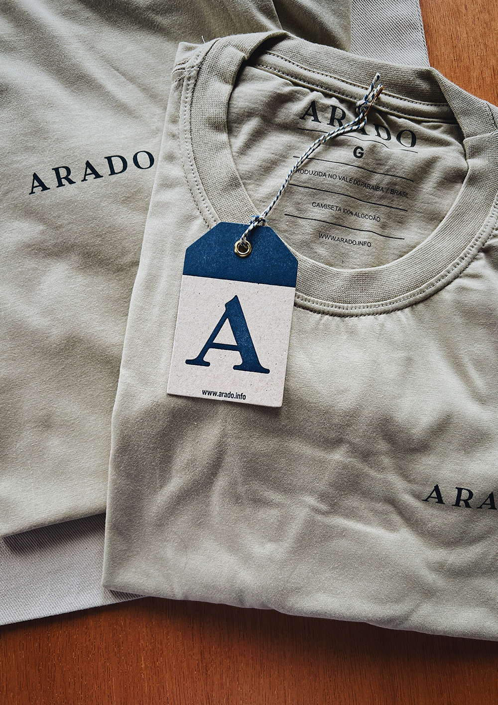
After validating the strategic content, we moved on to creating the visual identity. The logo written in all caps with a serif font speaks to its attentive look at traditions.
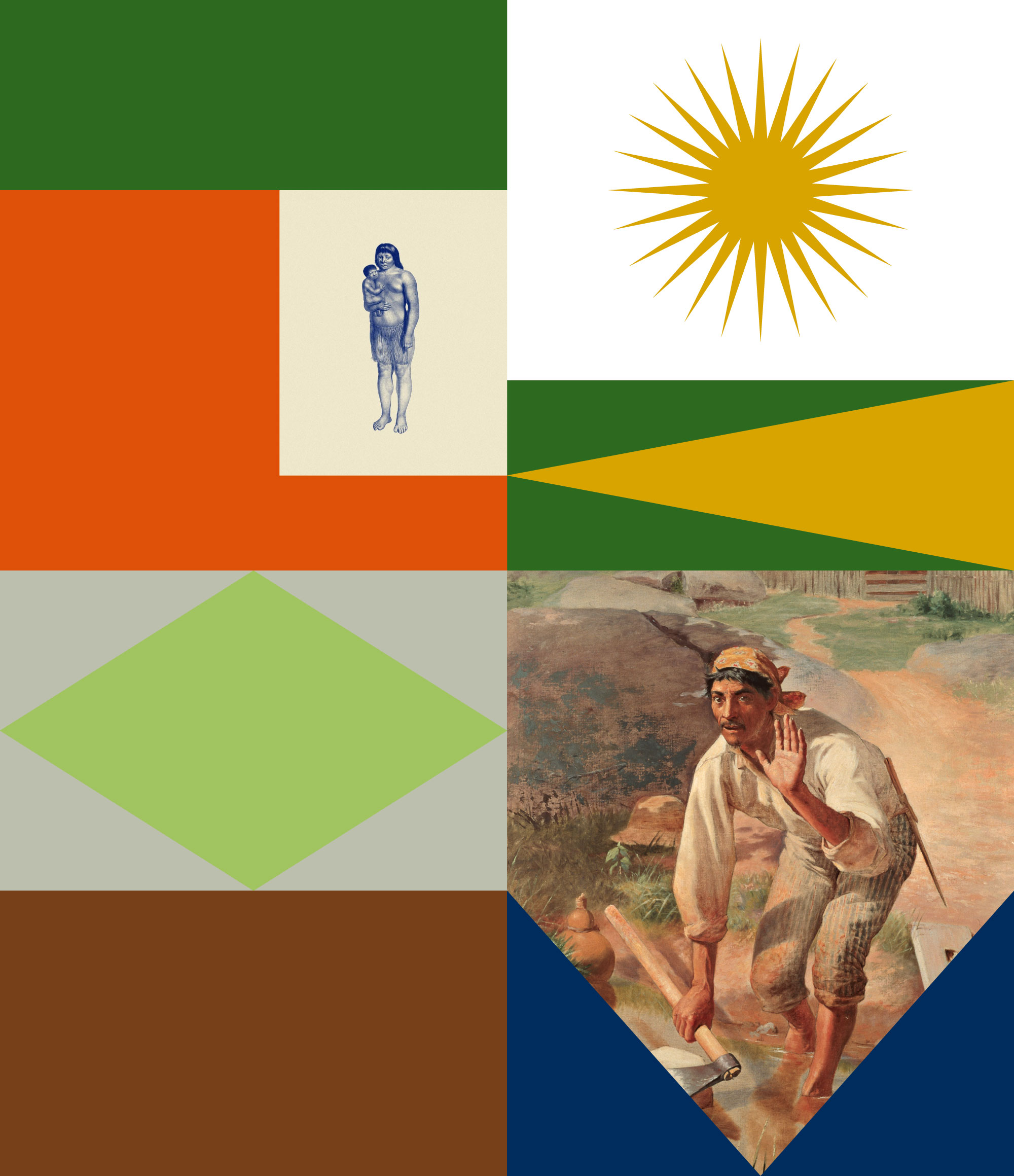
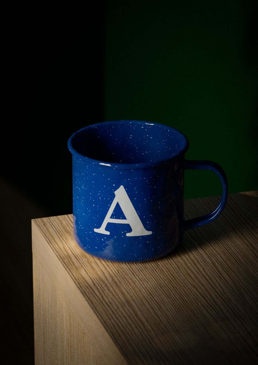
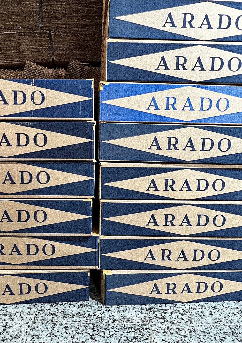
The palette and graphics are inspired by elements found in the initiative's study objects: the geometric elements and colors of architecture on the facade of homes and churches, with their whitewashed walls and their doors painted with synthetic enamel, the country bench, the trivet, the decorations, flags and banners of traditional celebrations.
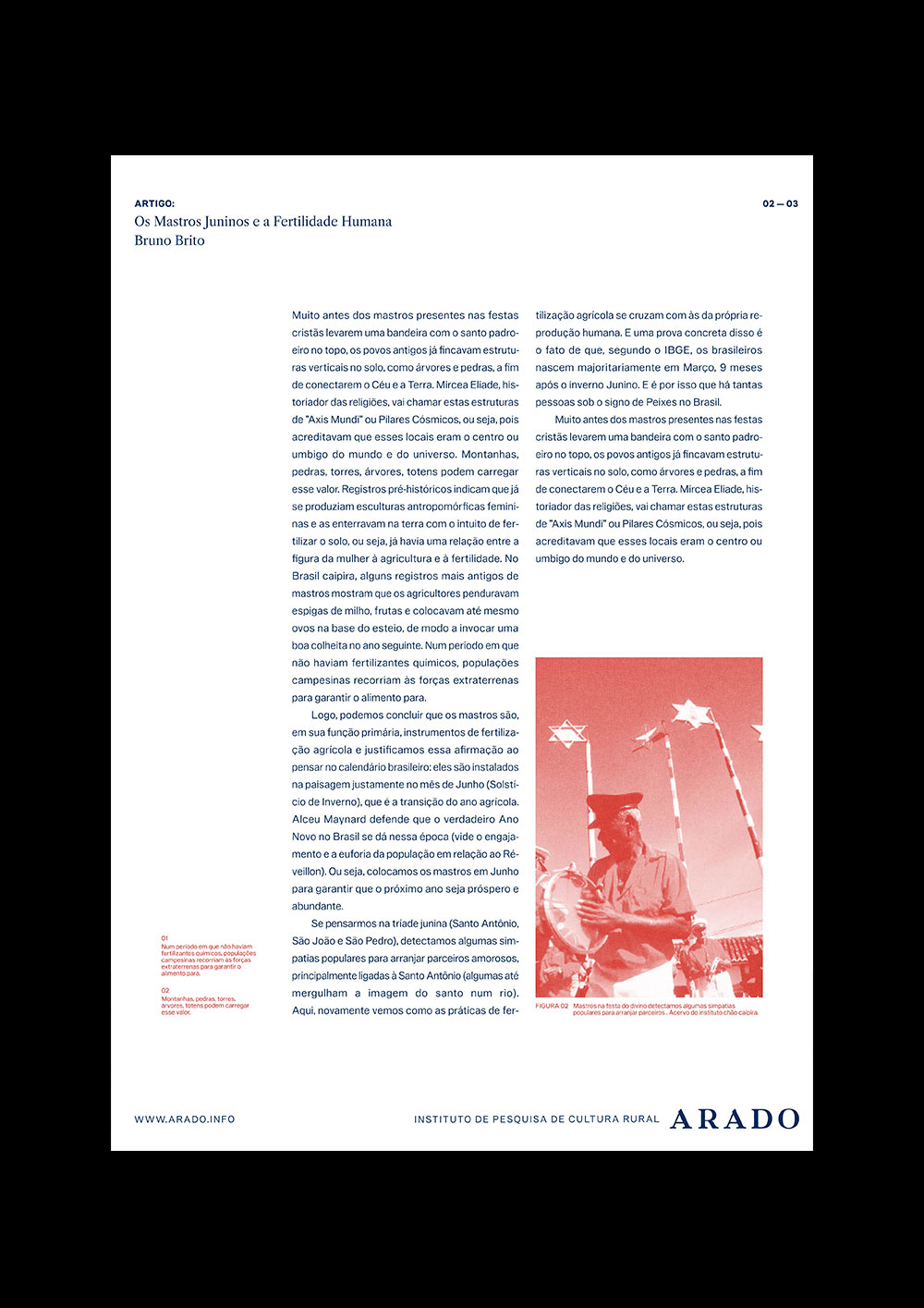
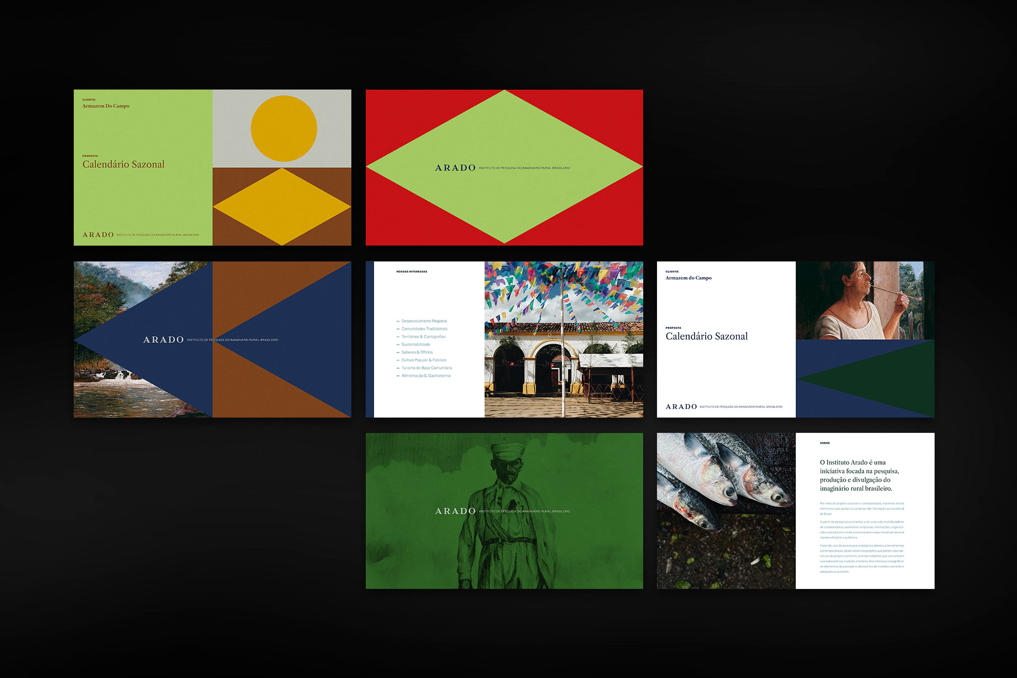
Together, the graphics and colors give dynamism and variety to the brand that produces content for different channels. The set is flexible and consistent enough for the different parts to be perceived as part of the same system, without the applications becoming monotonous.
