Niuá is a studio of original ceramics handmade by Carol Tsai, focused on developing useful objects, pieces that are resistant to handling and daily use, harmonious colors and simple shapes that can be combined with each other. It also offers regular ceramics courses and visits in its physical space.
Since 2014, the studio had been named after its creator, and in 2022 Carol called us to create the visual identity for the brand in its new moment, which was accompanied by a change of name and location.
In the initial phase of the project, dedicated to research and strategy, we created the essence of the brand, with guidelines that guide its communication and the creation of its visual identity. We understand that the brand values the functionality of the objects it creates and the beauty of its products, as well as the gesture present in manual making.
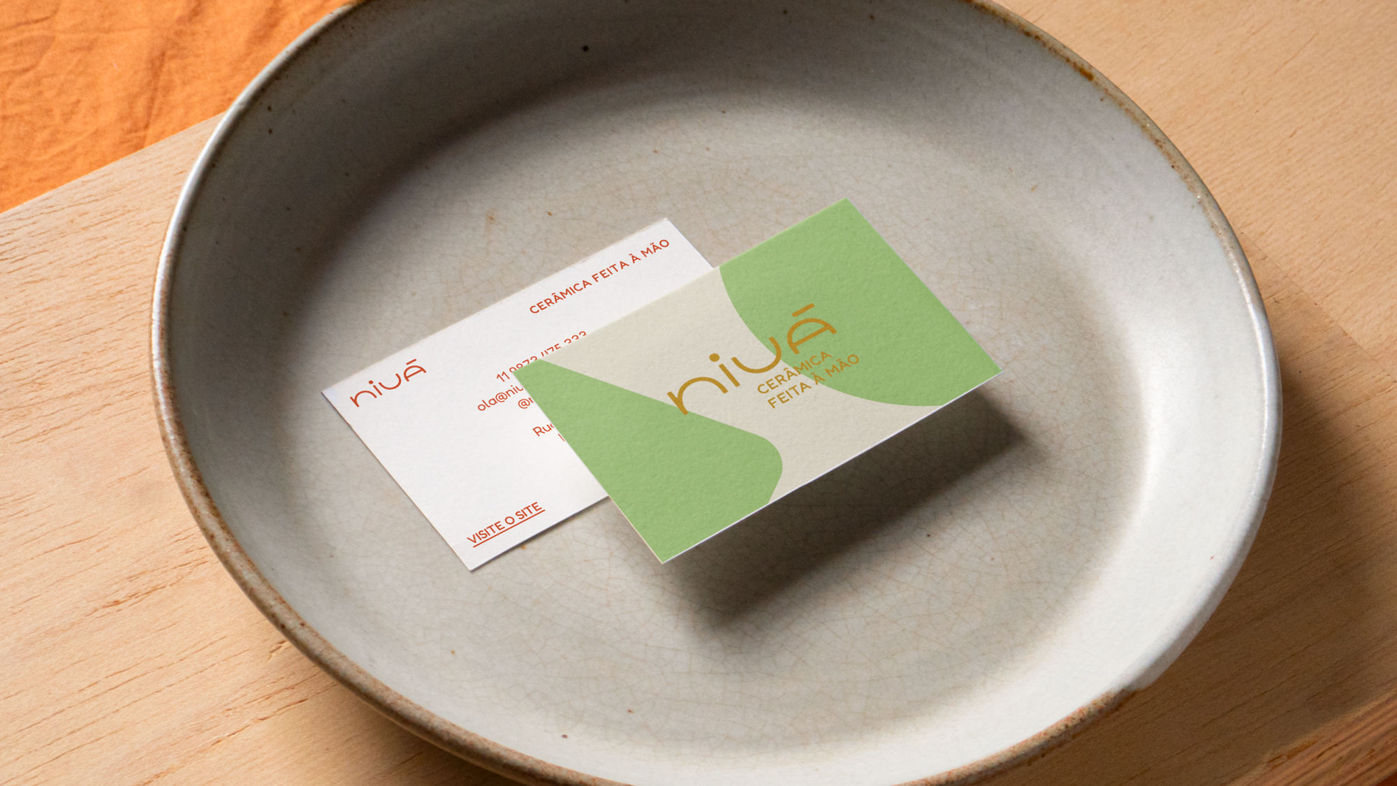
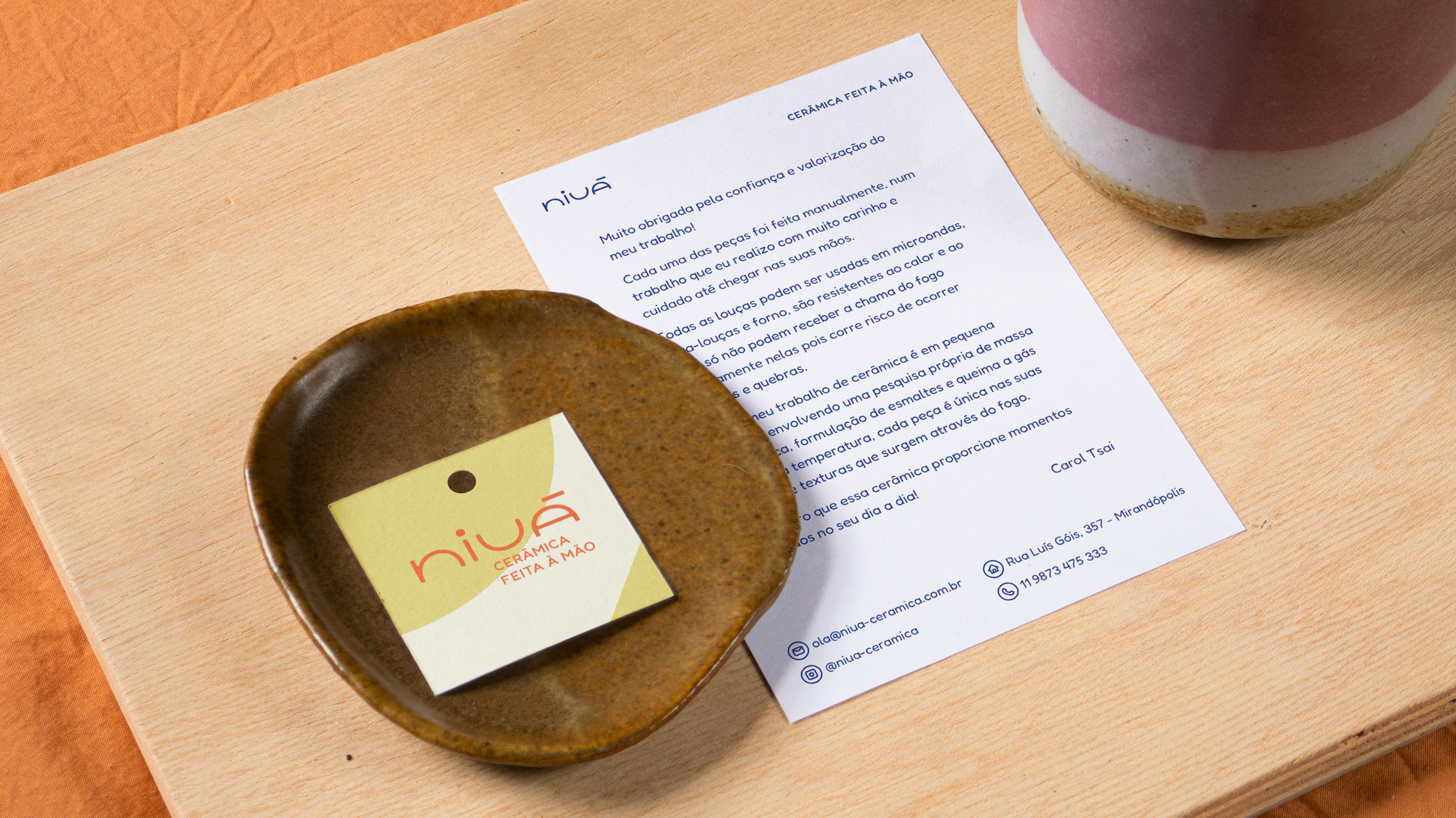
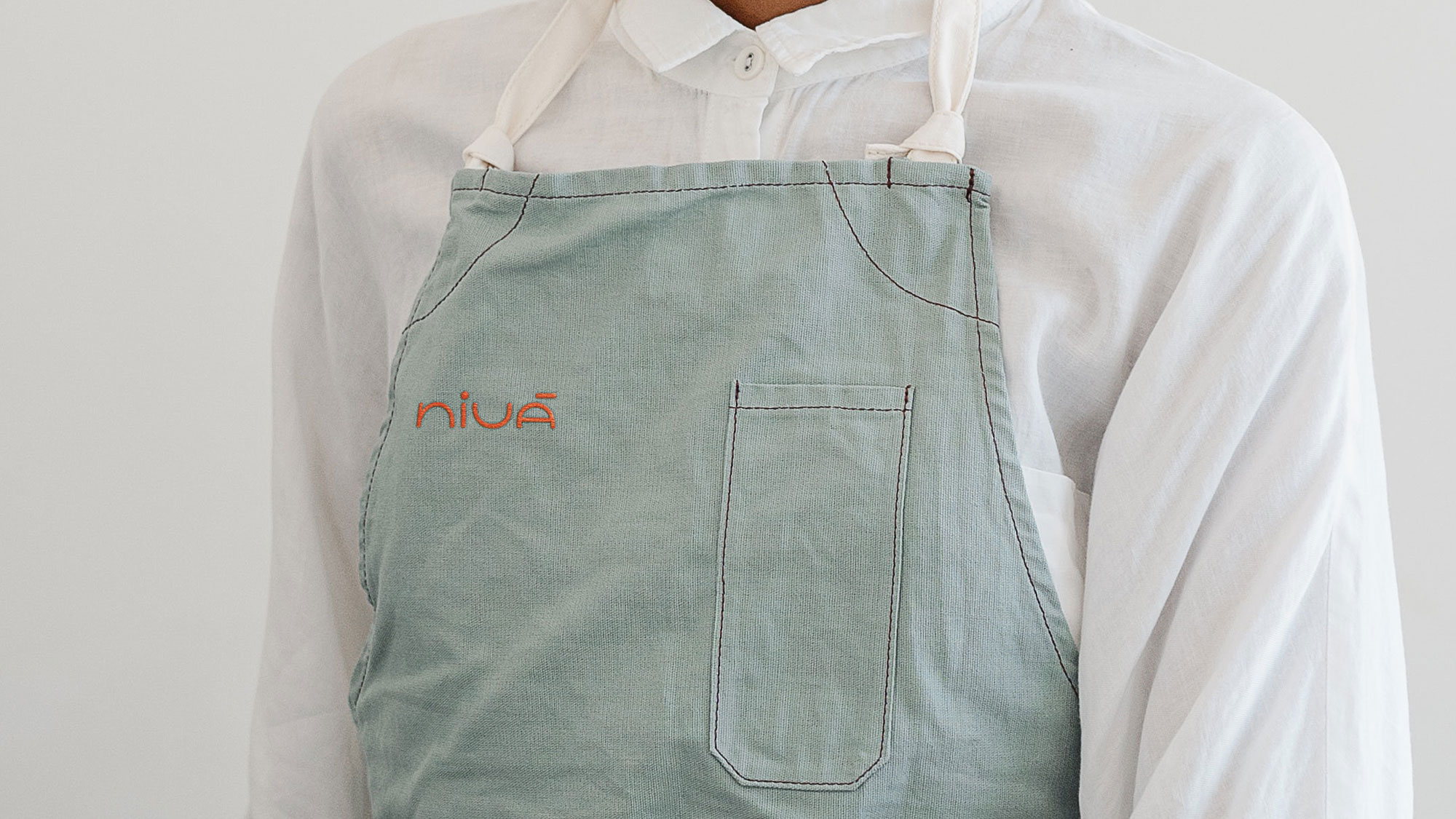
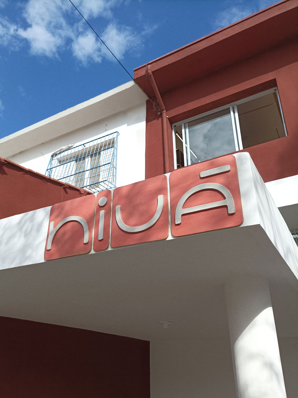
The visual identity is made up of a logo with letters inspired by the way the ceramist builds her pieces: precise and relatively symmetrical designs that emphasize the cleanliness, softness and gesture of their shapes. The letters created help to express a light, firm and cozy brand, with their smooth joints and generous distance between the letters – which also speaks to the void, an important aspect in ceramic production.
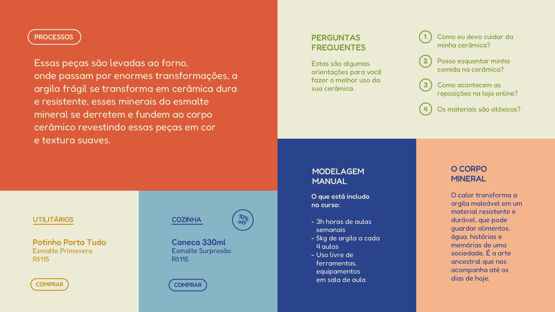
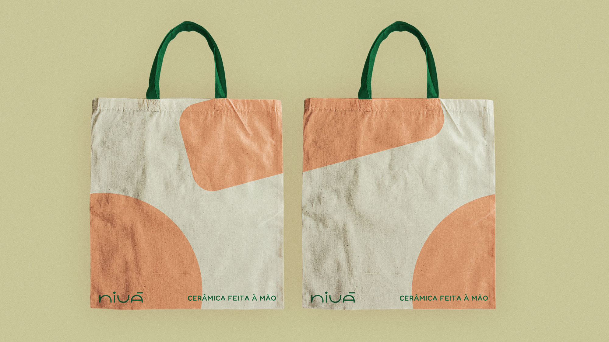
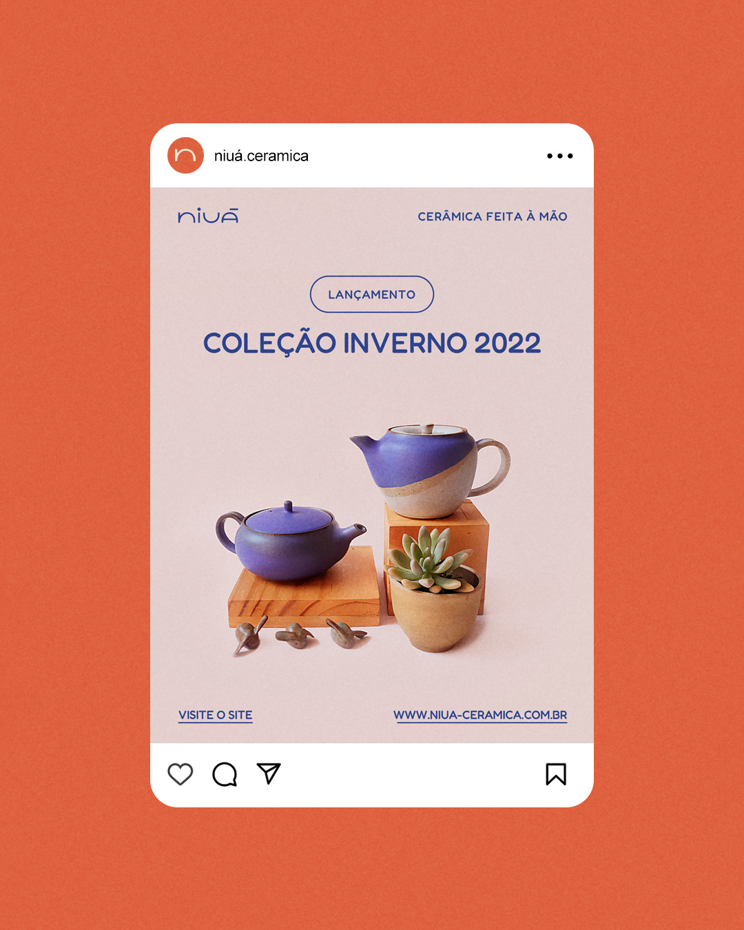
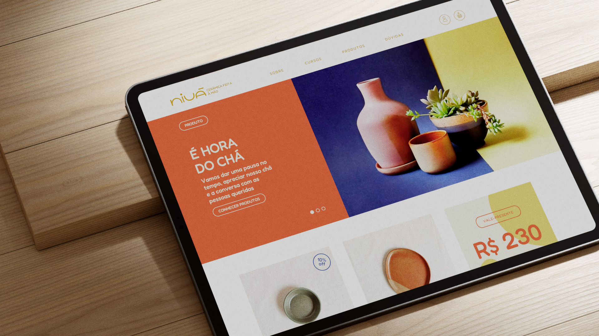
Maintaining the versatility of the colors present in the previous visual identity, we redesigned the palette with more contemporary and versatile tones that allowed a varied application on social networks, Carol's main point of contact. Using the dot of the "i" and the accent of the "á", we also created the graphics used in the background of the applications. The final set is flexible enough to maintain brand consistency across its varied applications.
