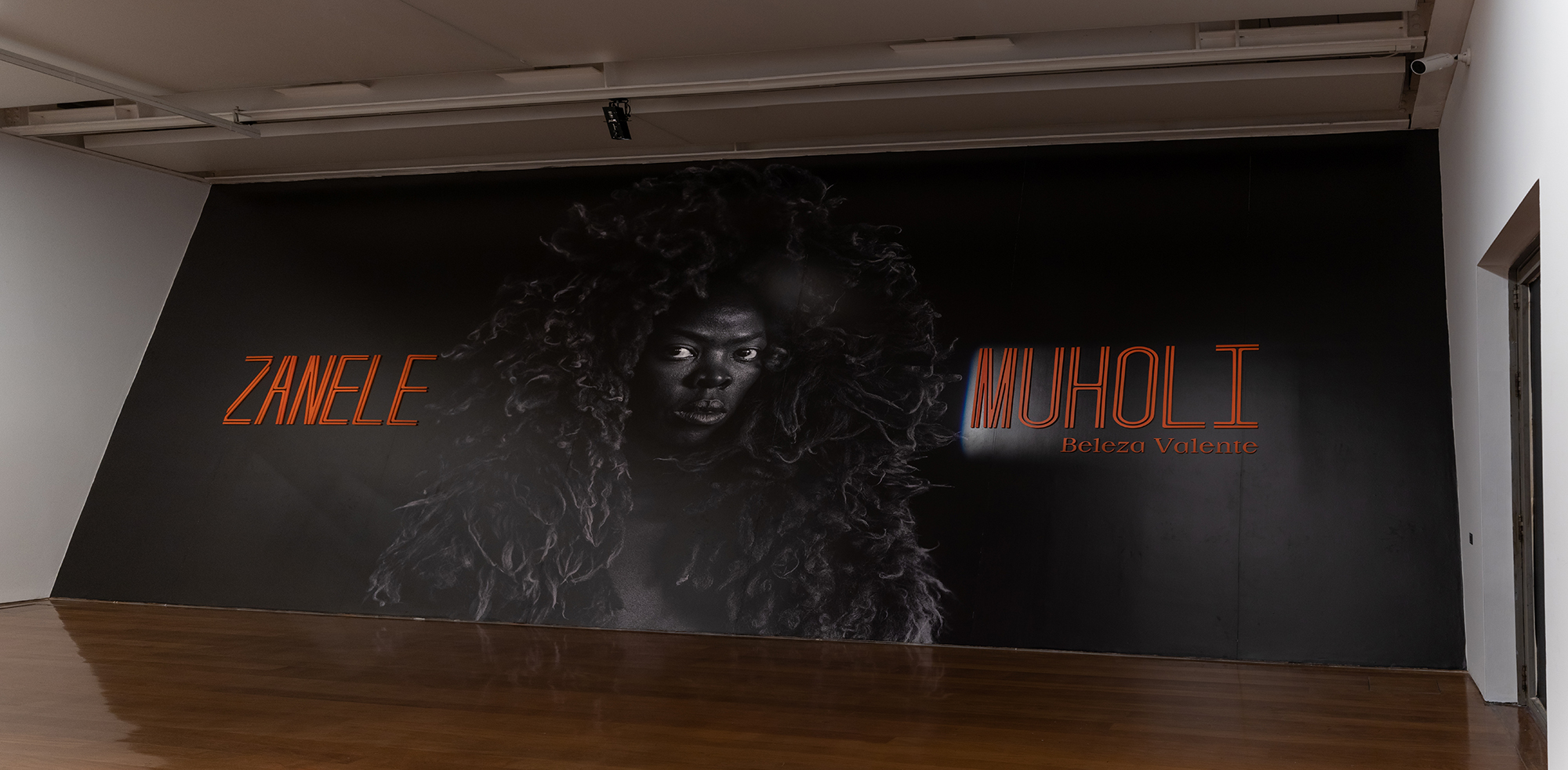
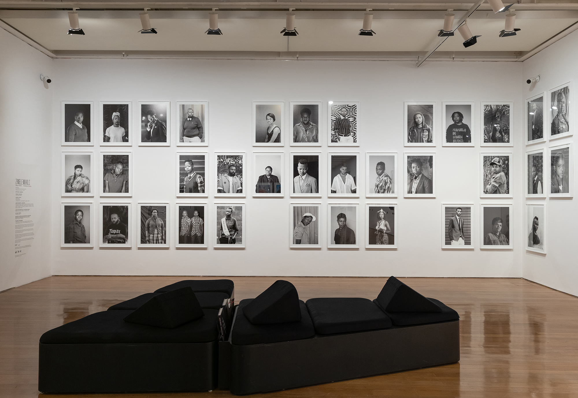
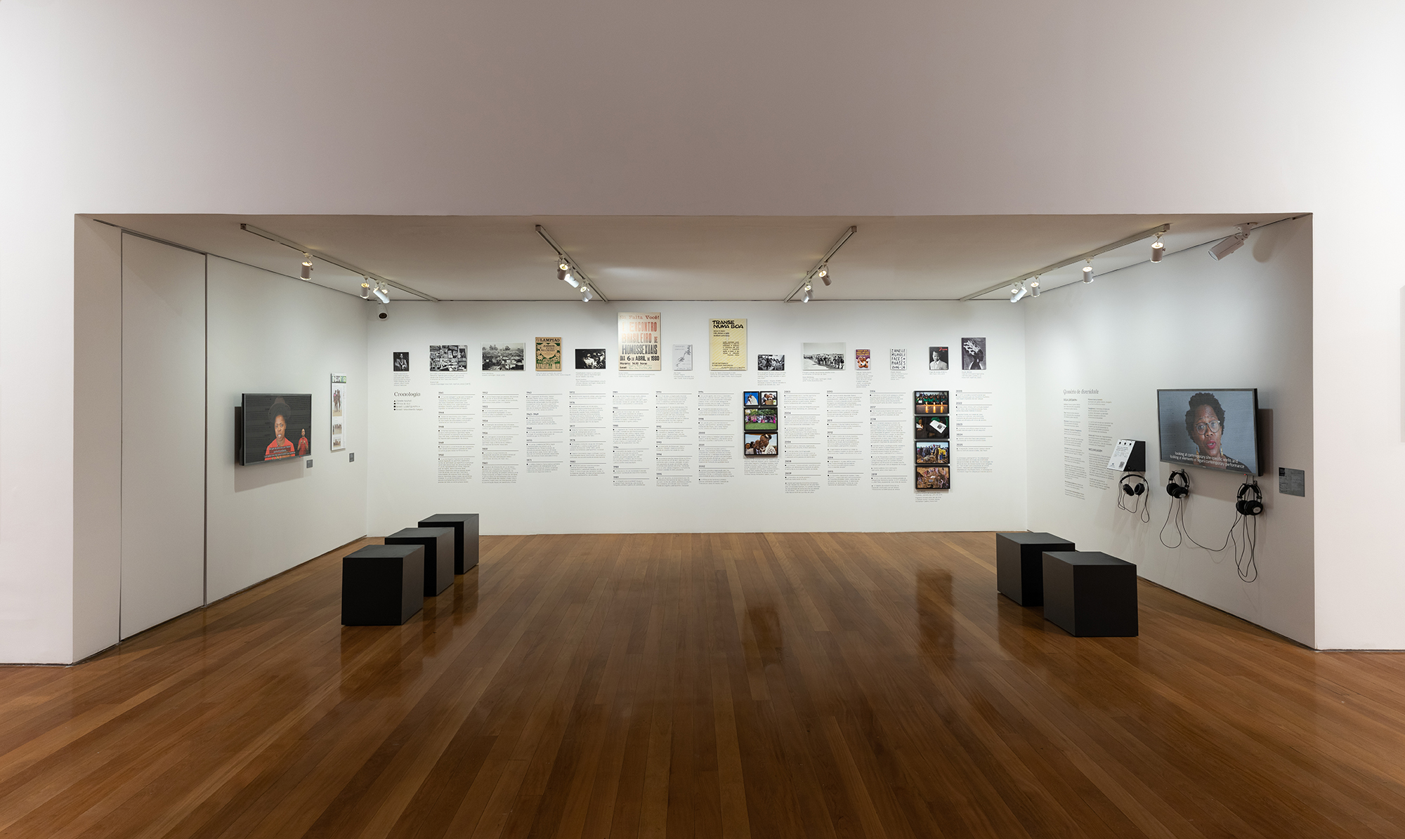
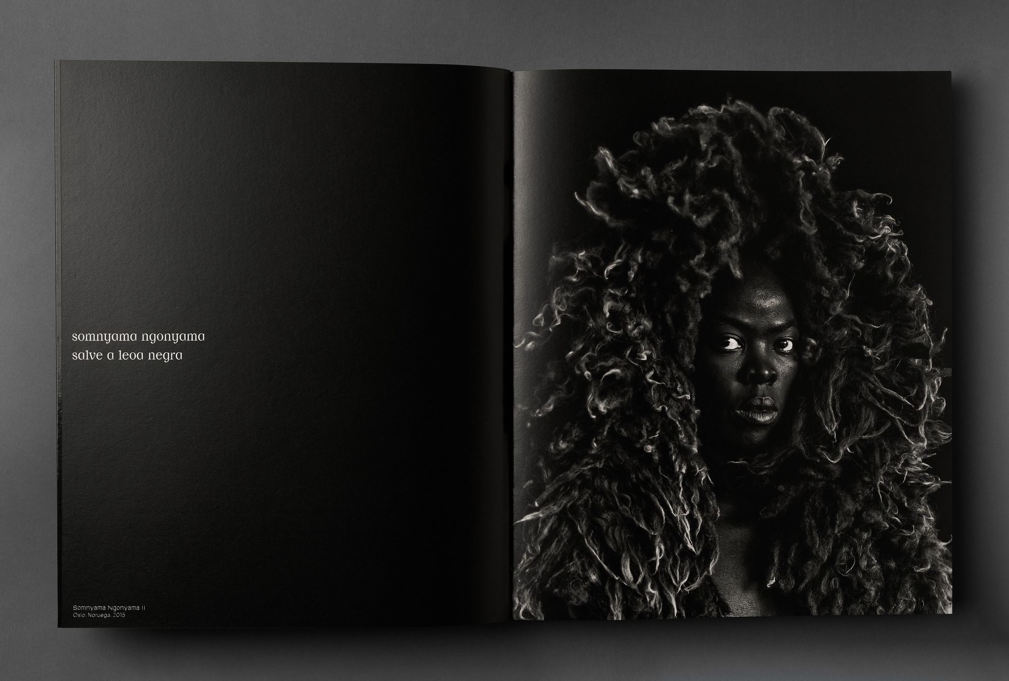
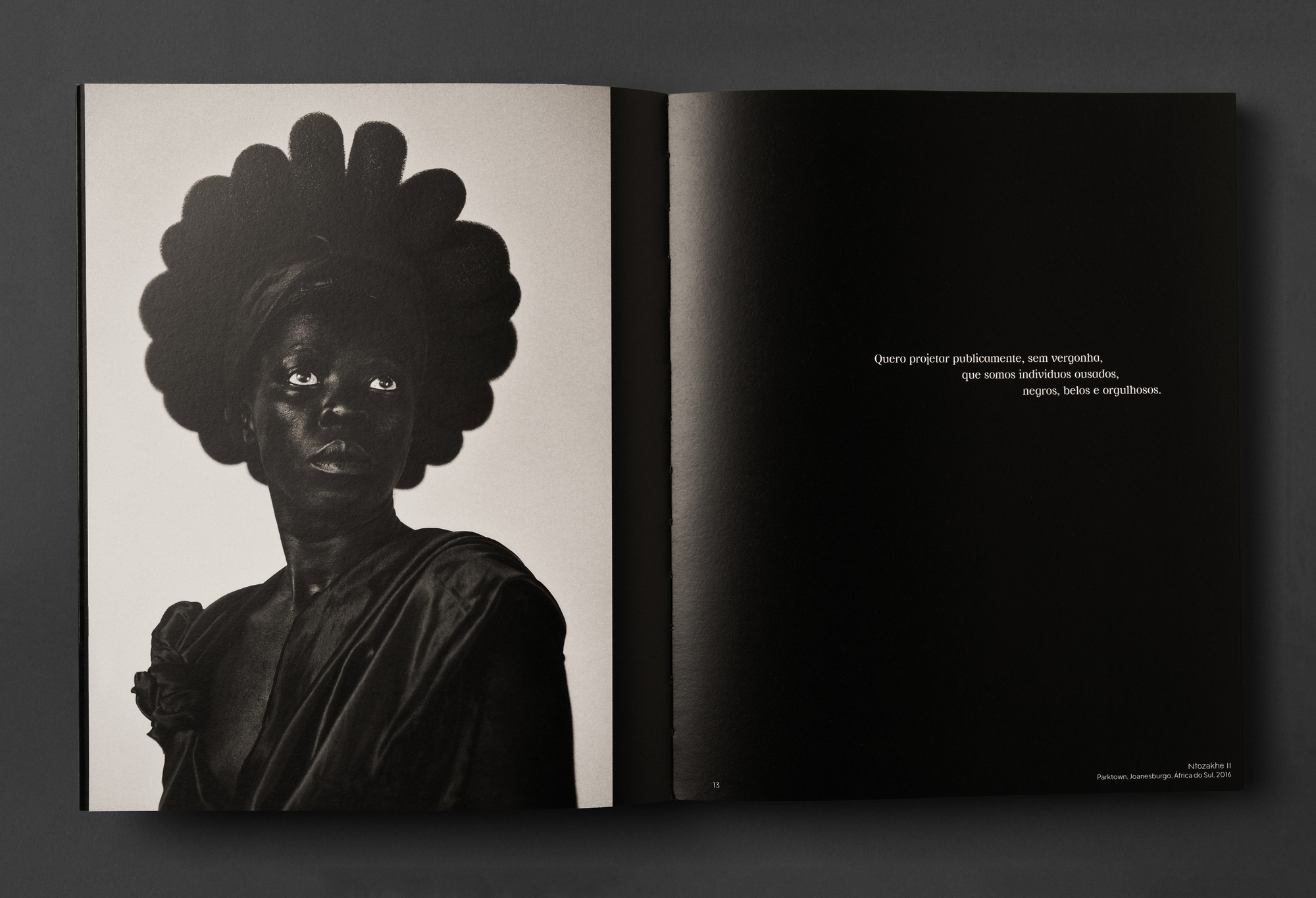
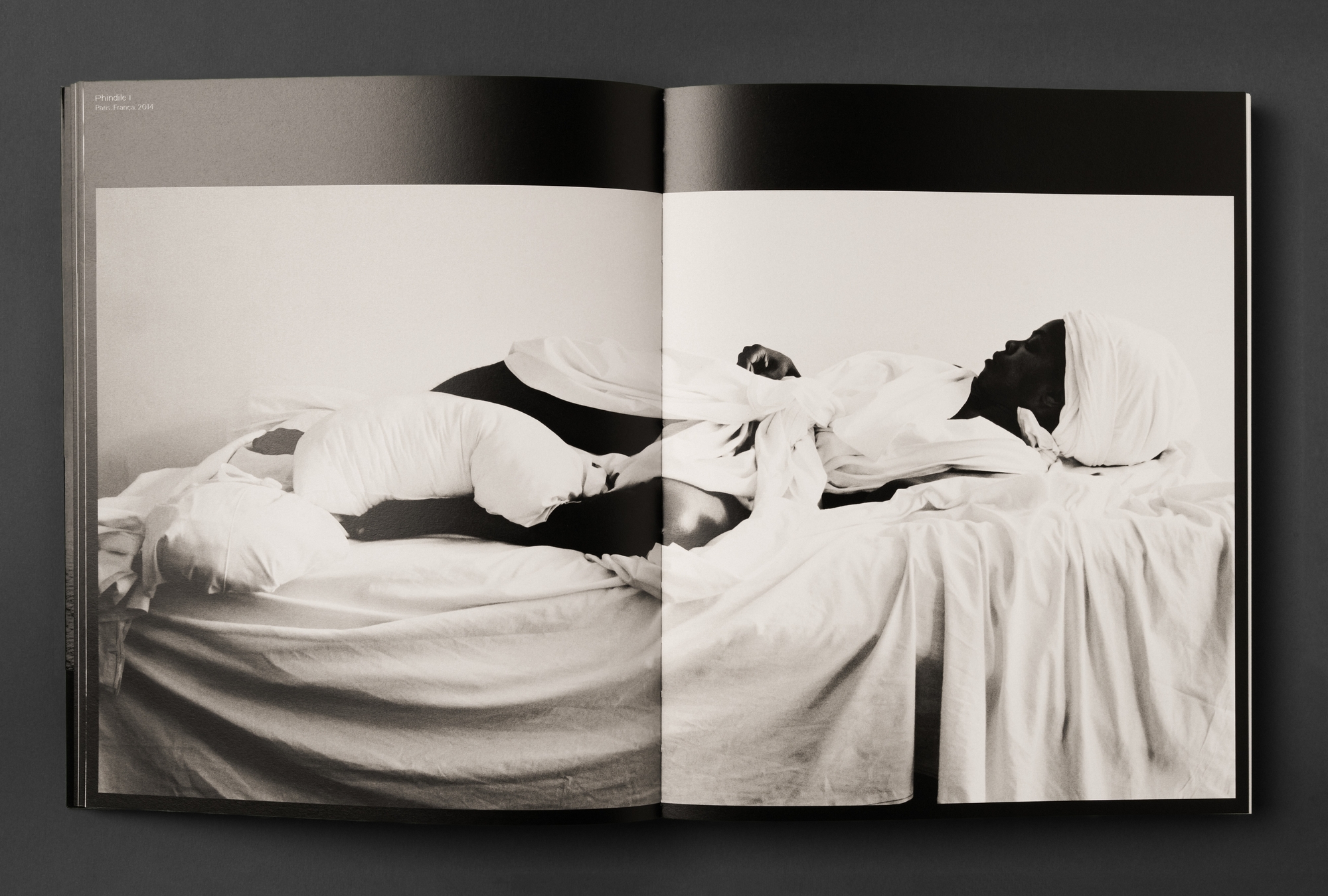
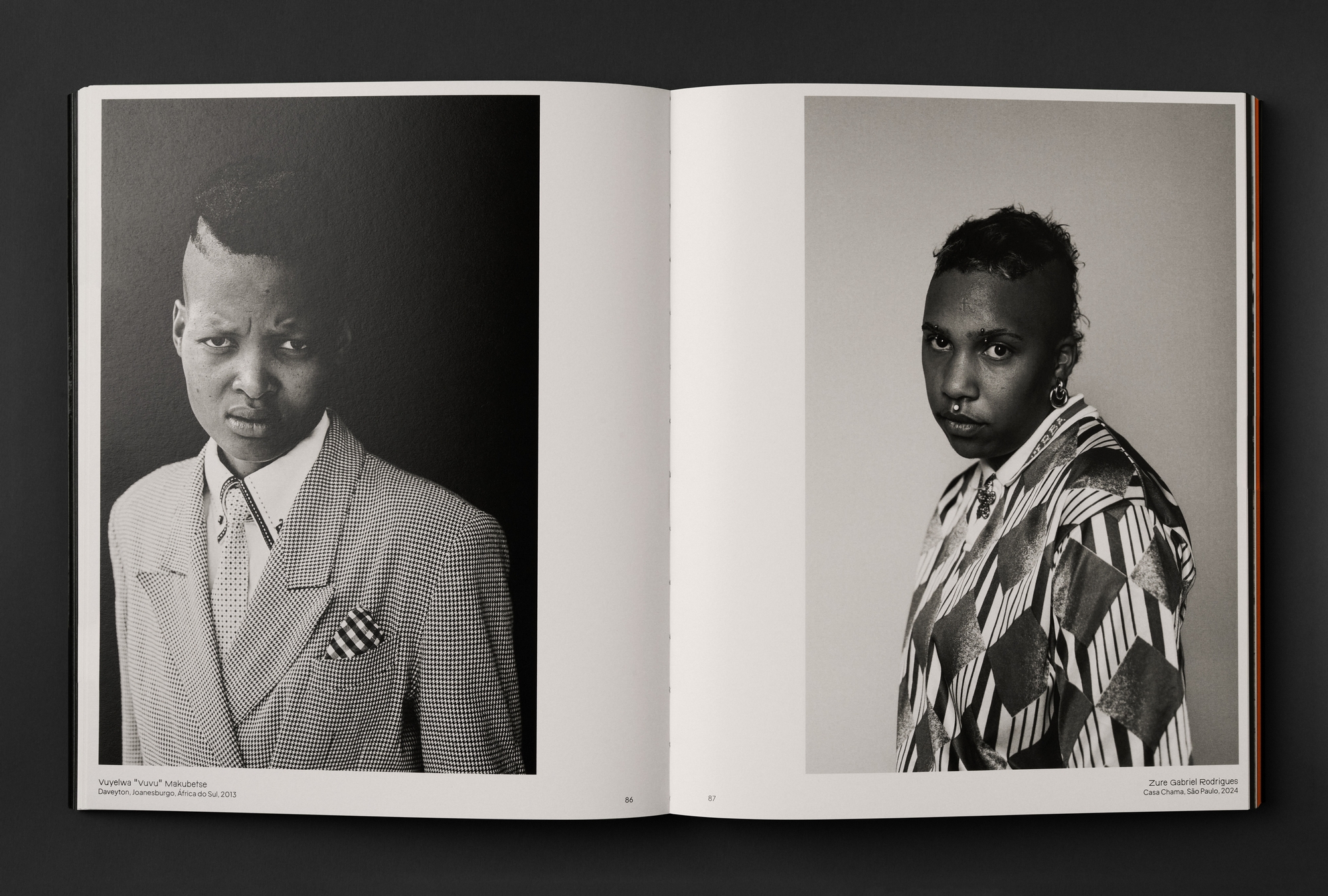
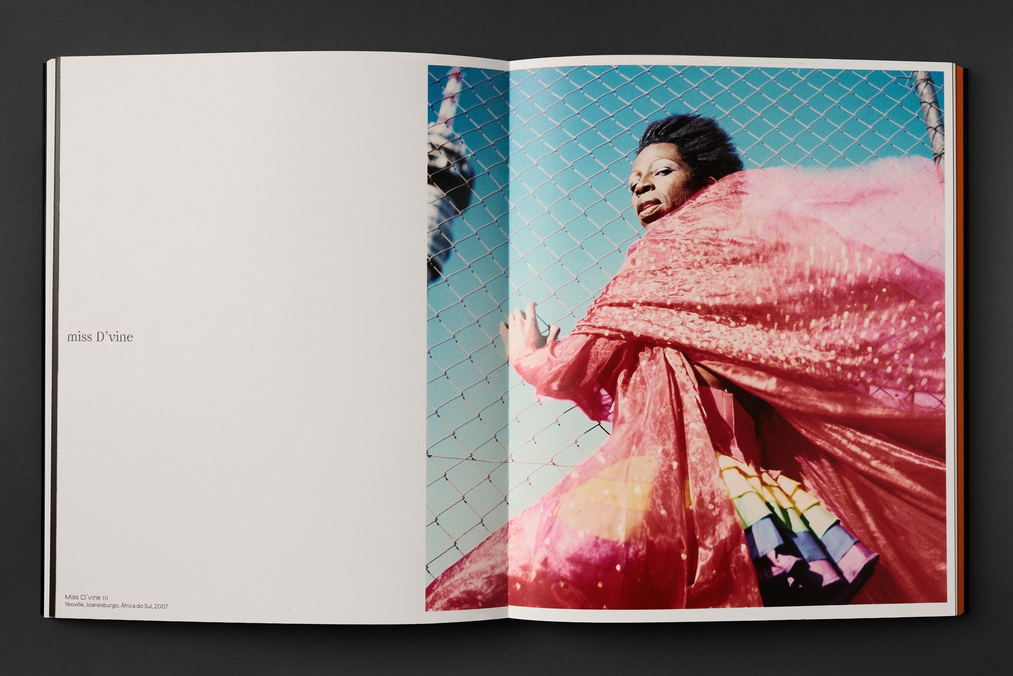
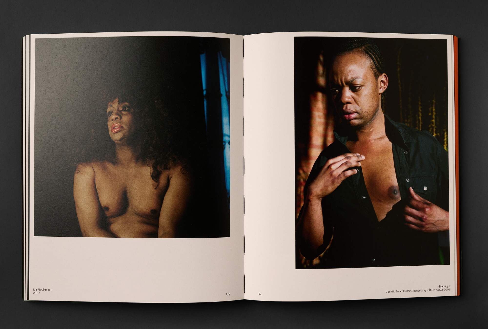
Since the early 2000s, Muholi, who defines themself as a visual activist, has documented the lives of the Black LGBTQIAPN+ community in South Africa and around the world. The exhibition, which ran at the Moreira Salles Institute from February to June 2025, brought together her main photographic series and previously unpublished works produced in Brazil. The catalog includes all the works presented in the exhibition, a long, previously unpublished interview with Muholi, conducted in Brazil, as well as texts, testimonials, and an extensive chronology created in partnership with the Museum of Sexual Diversity.
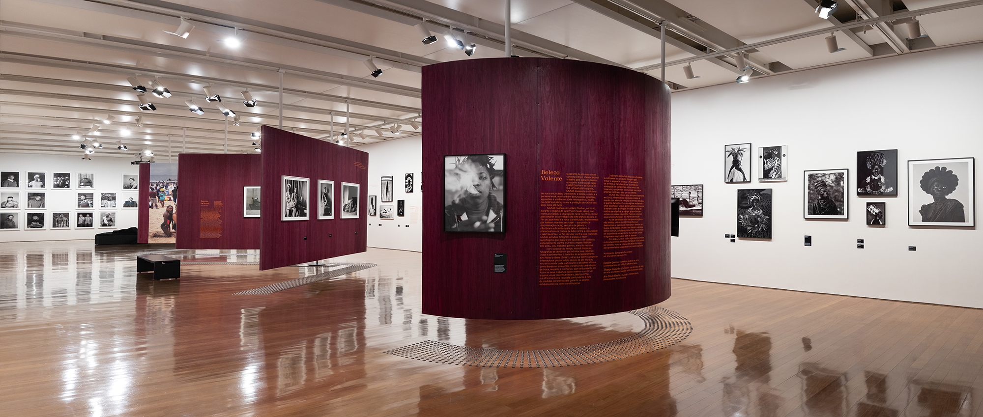
During the research phase of the project, we studied previous exhibition setups to understand how Muholi's work had been exhibited around the world and what specificities the exhibition in Brazil could bring. We also attended the lecture "Queer Design: Gestures and Practices for a Post-Binary Future" by B. Benedicto and Laura Daviña, who presented reflections and practices that connect with the exhibition's theme. Muholi states that their work aims to fill a gap in South African visual history, stating that "if I knew the faces of my grandparents, a part of me wouldn't feel so empty."
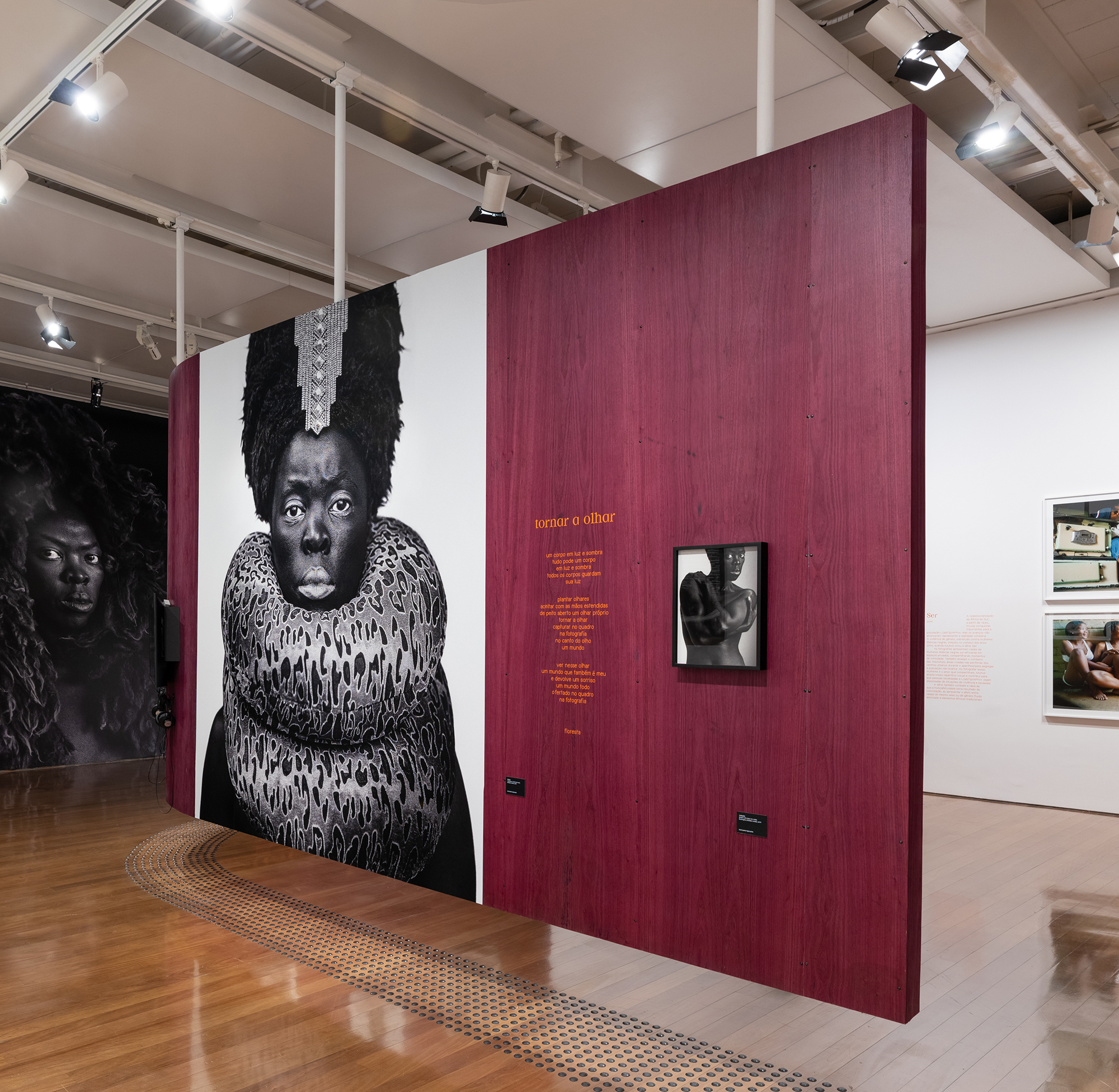
Muholi states that their work aims to fill a gap in South African visual history, stating that "if I knew the faces of my grandparents, a part of me wouldn't feel so empty."
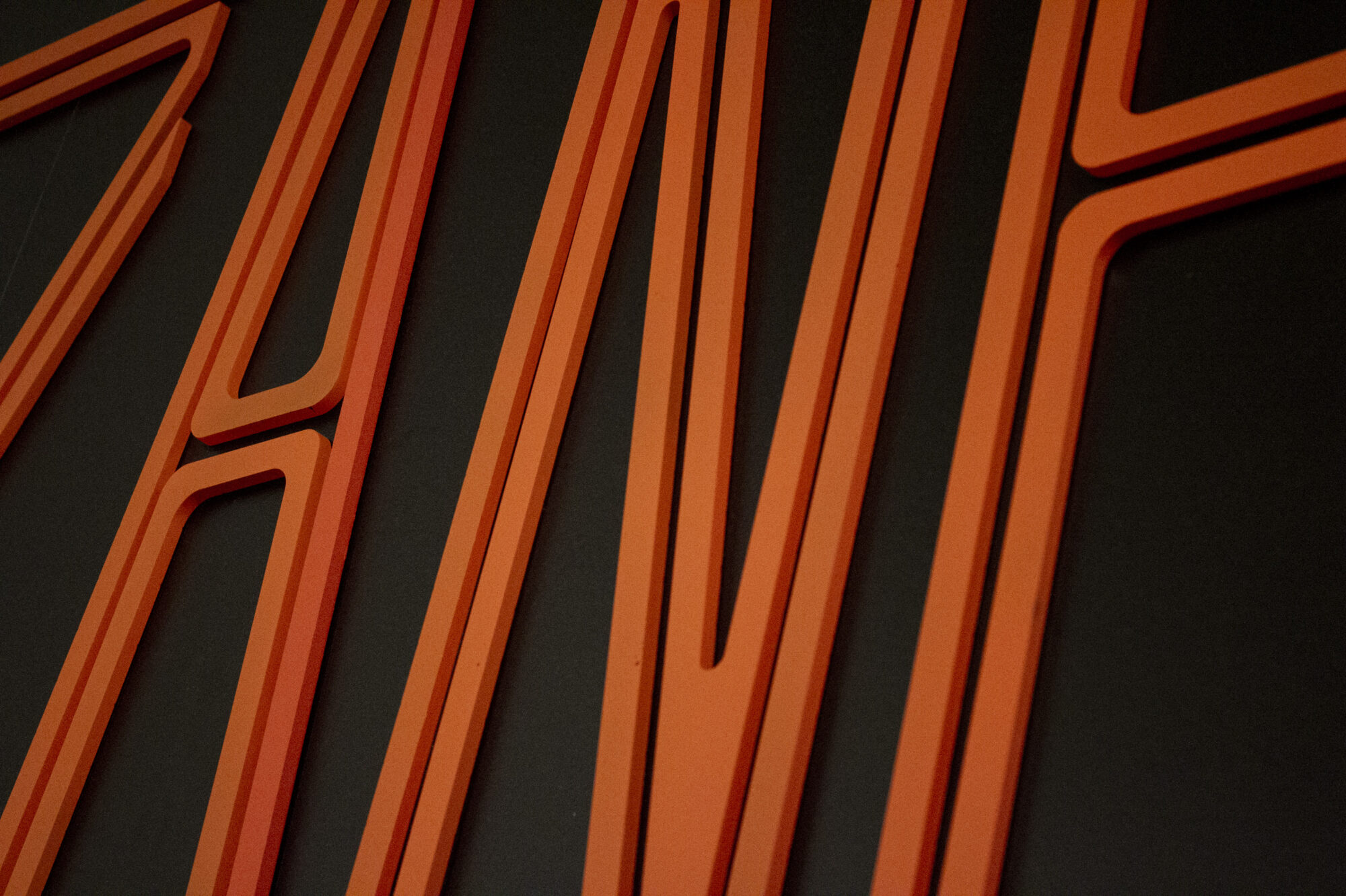
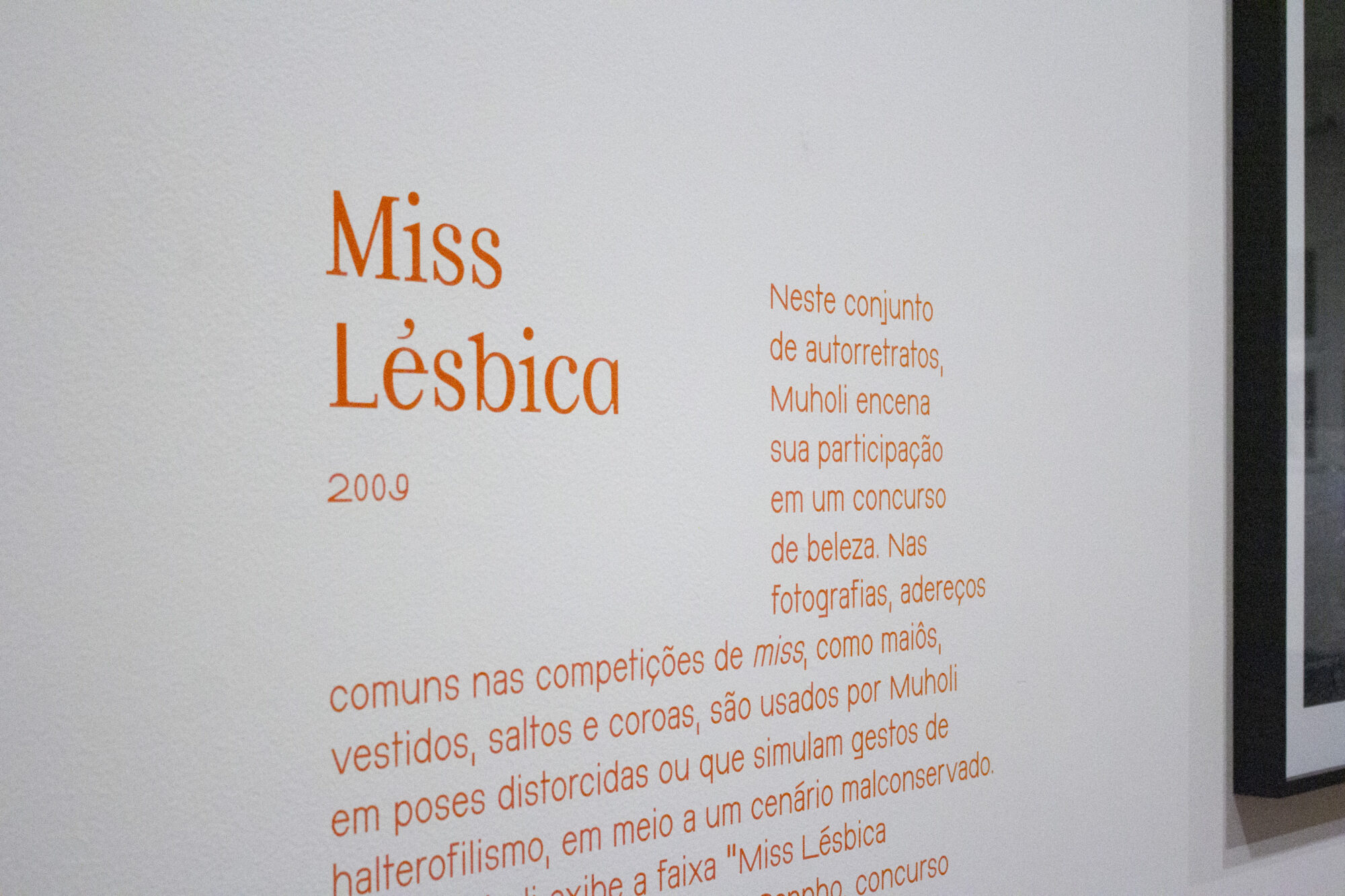
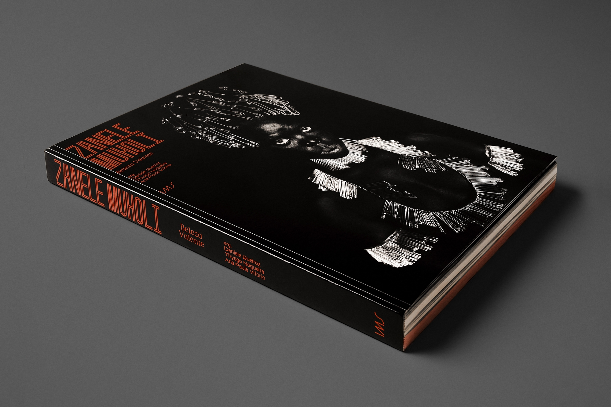
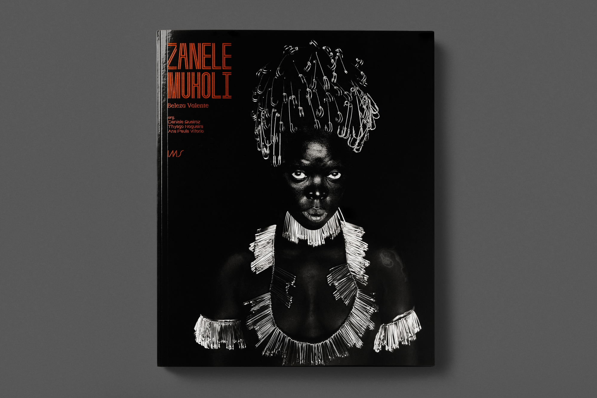
Since the photographs are graphically stunning, we opted for a typographic approach, without additional graphics. We designed the letters of the exhibition title with shapes that would reflect the idea of gaps: hence, the letters have an internal void within their design. This internal void speaks to the idea that Muholi's portraits subjectively connect with the people portrayed—the internal space would then be the "essence" of the letter. The empty spaces around the text titles also seek to evoke these gaps. The fonts used in the exhibition's texts are DINDong and Homoneta, created by the collective Bye Bye Binary, whose focus is on incorporating characters that encompass different gender identities through letterforms (this is in the collective's native French).
The fonts used in the exhibition's texts are DINDong and Homoneta, created by the collective Bye Bye Binary, whose focus is on incorporating characters that encompass different gender identities through letterforms (this is in the collective's native French).
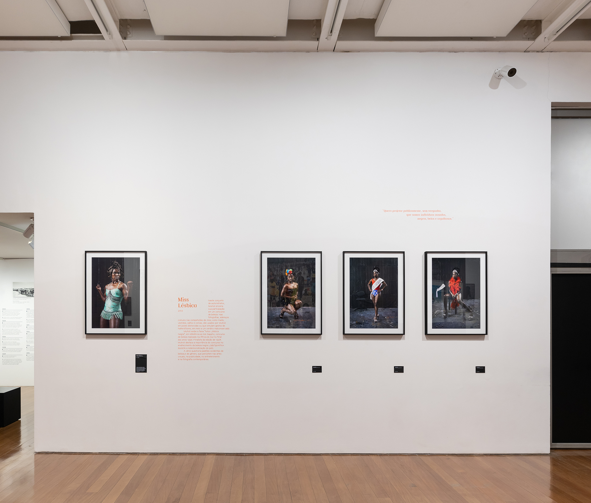
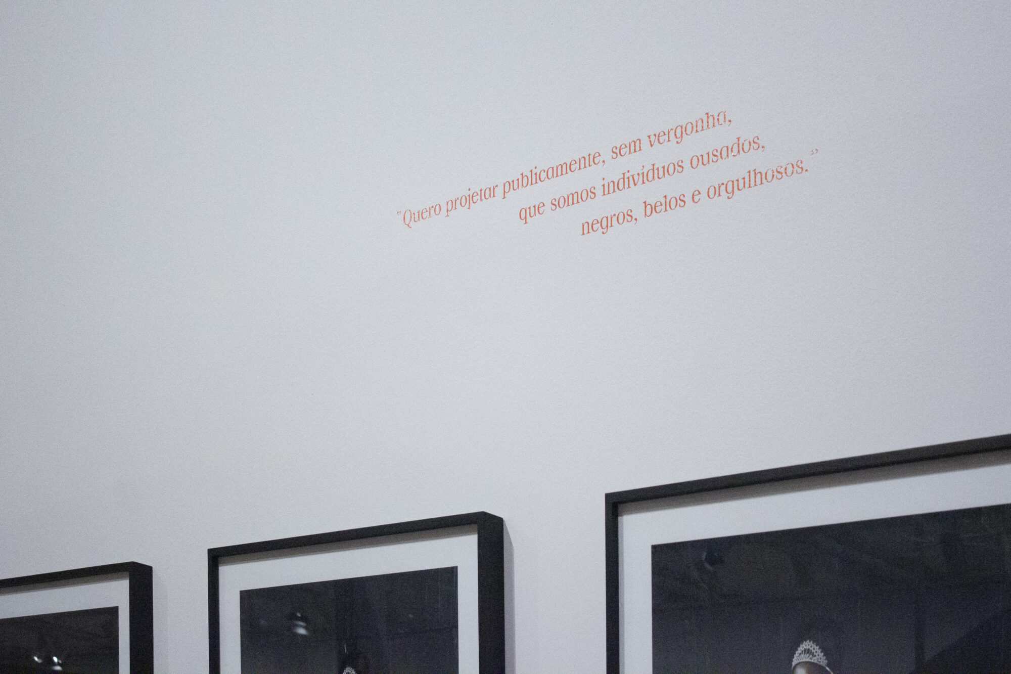
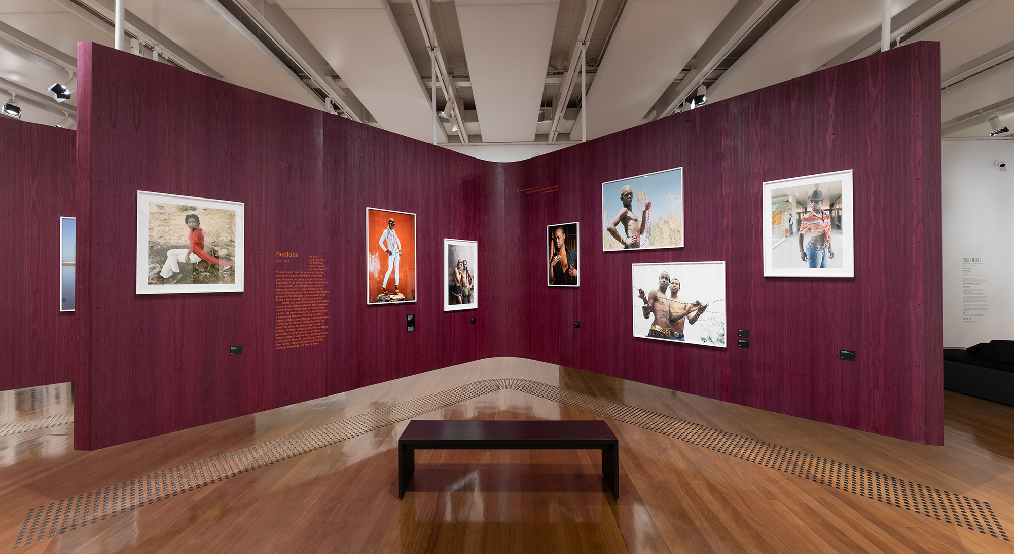
Since most of the photos are black and white, we considered using a color that would bring energy to the collection, in keeping with the activist nature of Muholi's work – who has stated that, as an activist, they uses artistic media as a manifesto.
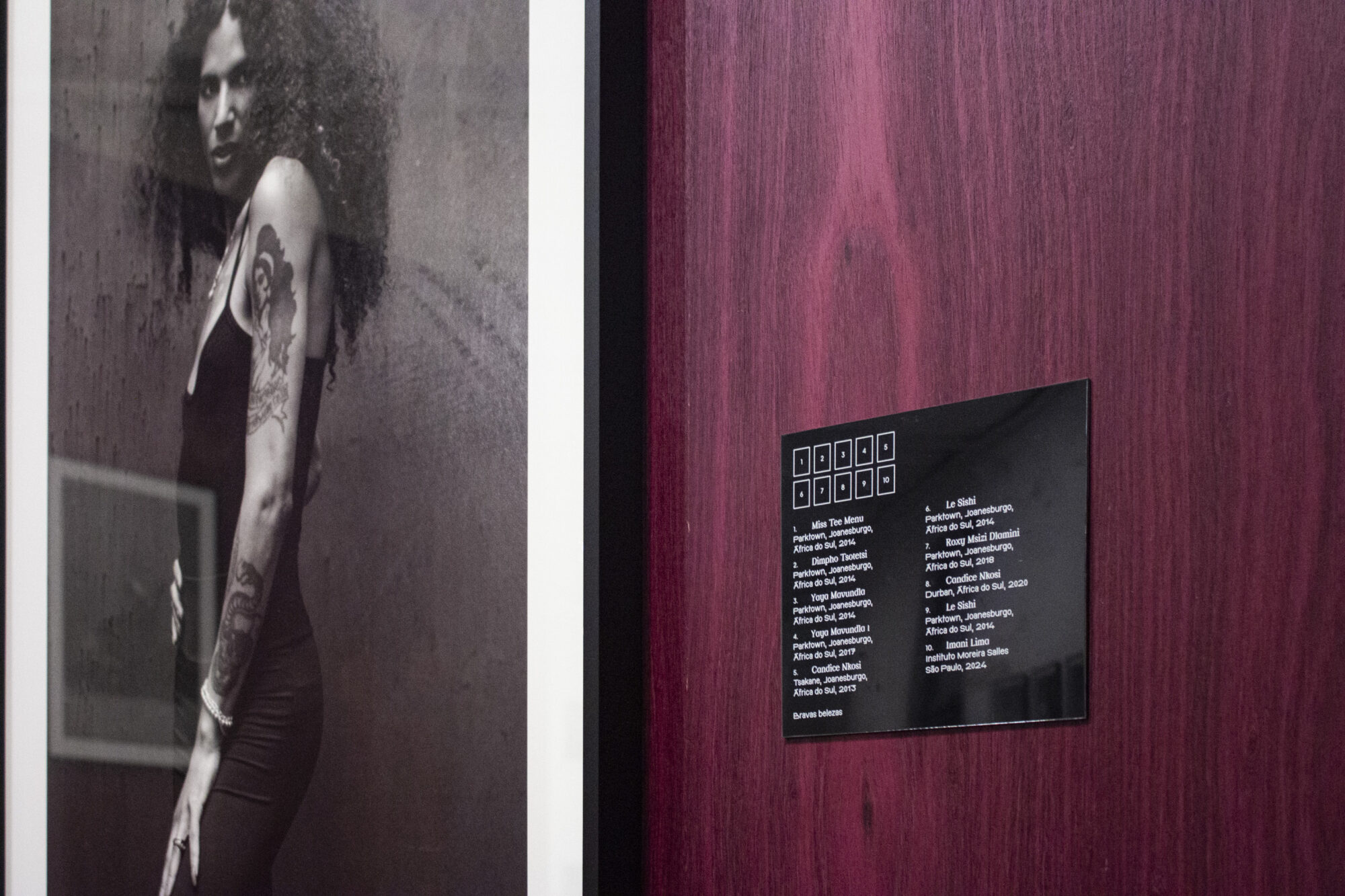
The catalog's graphic design inherits the characteristics of the exhibition's visual identity, in addition to featuring a technical specificity: its design took into account the different printing methods used throughout the booklets that comprise the publication, making it challenging to intersperse modular sequences of black and white and color images.